K’Vira
·
K’vira sells organically grown, locally sourced products from the rich agricultural regions of Tumkur and Chikmagalur, Karnataka.
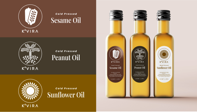
For this project, I designed the brand’s logo and created packaging
labels for their line of cold pressed and wood pressed oils.
Harvesting Identity
K’vira is a brand rooted in sustainable farming and organic practices. To bring this to life, I designed a clean, minimal wordmark and developed a packaging system for their range of cold-pressed and wood-pressed oils, including sunflower and coconut.
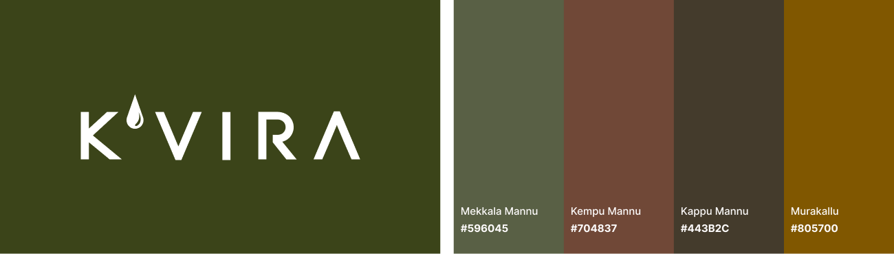
The wordmark is intentionally simple for clear recognition on shelves. A minimally stylized oil drop introduces visual character while keeping the design clean. The color palette takes inspiration from the geology of Karnataka, India; a state marked by varied terrain and climates, with fertile black, red, and alluvial soils. These earthy tones reflect the richness of the land and celebrate the diversity of its agricultural heritage.
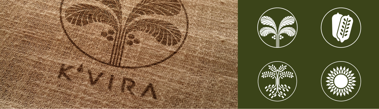
Botanical Geometry for Unified Design
To distinguish each oil type while maintaining visual consistency, I created a set of minimalist, botanical-inspired motifs. These vector illustrations added clarity and elegance to the labels, giving each product its own identity within a unified system.